

Why Angular is a Game-Changer for Web Development!
Development
- 15 Apr, 2025
- 673 Views
- 0 Comment
Trends in website design are ever-evolving. Every month, certain outdated design fads give way to fresh ideas in web design.
Your brand image depends on being up to date with the newest trends in website design, and your design decisions may even affect leads and conversions.
Indeed, 94% of first impressions on websites are influenced by their layout. As soon as a visitor lands on your website, this occurs in just 50 milliseconds. 75% of users believing that well-designed websites are more trustworthy, and improving your design can increase conversions by up to 500%.
You can use this blog as a resource on the newest website design trends of 2025, whether you’re a web designer seeking fresh ideas or a business owner thinking about redesigning your website.
1. Dark Themes
White or off-white backgrounds were the norm for site design for many years. However, a significant change has occurred in the past year, with an increasing number of websites adopting dark themes.
This is true for both newly designed websites and those that are redesigned.
Dark themes make reading easier and less taxing on the eyes. Dark themes assist address accessibility issues for individuals with visual impairments and emit less blue light.
In order to stay up with the latest design fad, Buildfire recently redesigned their website and went with a dark theme.
2. Mobile-First Designs
Globally, mobile devices account for more than 70% of all website traffic.
Google now views your page differently as a result of this change in user behavior. Google has formally finished implementing mobile-first indexing as of October 2023, which means that mobile websites are given precedence over desktop versions.
More mobile-first designs are being used so far in 2024, but many web designers are still lagging behind.
Everything you do with a mobile-first design prioritizes the smartphone experience over the desktop version. Screenshots from Typeform’s mobile website are shown here.
3. Piloting Navigation
The majority of websites adhere to best practices and standards that users have come to expect. There are menus along the top navigation bar, logos in the upper left corner, and the option to click the logo to go back to your home page from any page.
However, in 2025, more websites are employing experimental navigation techniques that “break the rules.”
To help you understand, here is an example:

First of all, the navigation bar runs vertically rather than horizontally on the left side of the screen.
The brand name (Book), is therefore displayed in the center of the screen rather than in the corner as it would normally be.
It deviates from the standard, yet it’s subtle and not insane.
4. Dark Mode
Although they are quite similar, dark mode and a dark theme are not the same thing.
Users can change from a typical light theme to its darker equivalent with this website design trend. This can be done automatically depending on the time of day or manually by pressing a button on the screen.
For those of you who want to try out the dark theme trend but aren’t quite ready to commit, this is an excellent choice.
You may let consumers make their own decisions and maintain your original design.
Even better, you can do some experiments to determine which version is most frequently utilized and whether your lighter or darker settings convert more quickly.
5. Differing Shades
In order to make specific components of the page stand out and pop, I’ve seen a number of websites start using contrasting colors. This works especially well for CTA buttons.
Against the dark navy backdrop, the gradient pink and purple hues truly pop off the screen. All three of the page’s CTAs—Book Consultation, Get Started, and Learn More—use this design strategy.
Your eyes are instinctively drawn to such buttons, whether you are aware of it or not.
It’s a little sleeker and more contemporary than simply putting a red or green CTA button on a white background.
6. Eco-Friendly Designs
Website servers can consume enormous amounts of electricity, contributing to carbon emissions that can harm the environment.
Some companies are beginning to use eco-friendly design to lessen their carbon footprint.
An excellent illustration of this is Root Web Design. In addition to helping companies create carbon-neutral websites, they also have an eco-friendly website of their own.
An eco-friendly web design can be made in a variety of ways. The first approach is to keep your files small. It’s also beneficial to remove big graphics, films, and pictures from the design.
Another option is to employ an environmentally friendly web host that powers your servers with renewable energy.
7. 3D Designs

Creating the appearance that the page is three-dimensional is another method to give your web design depth.
In order to mislead our eyes and make page elements stand out in three dimensions, contemporary site designers employ techniques such as shadows, highlights, motion, and contrasting colors.
Take note of how much darker the birds at the bottom of the screen are than those at the top. Additionally, they employ highlights and shadows strategically to create the illusion of a light source emanating from somewhere.
Everything is brought together and given the complete 3D sense by the small movements and a single, vibrantly colored bird in the middle of the page.
8. Parallax Scrolling
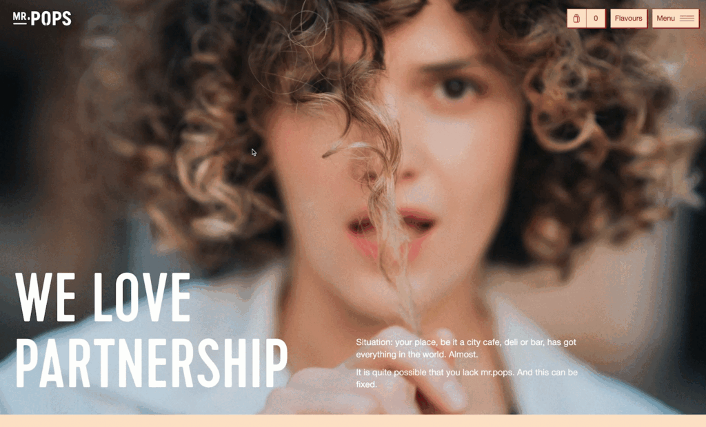
On flat surfaces, parallax scrolling creates the appearance of depth and adds motion effects to websites.
When users scroll through the website, the background elements move more slowly than the foreground ones, creating a more dynamic and engaging experience.
First, the background image of the person tugging on their hair is slower than the hero text, “We Love Partnership.”
Even more distinctively, the second section of the page makes advantage of parallax scrolling.
The text in this instance is the background element, and it travels more quickly than the rotating logo in the middle of the screen. It’s a neat effect that instantly gives the website a high-tech, contemporary vibe.
9. Storytelling
Storytelling is a skill that contemporary brands have perfected.
This trend is all about assisting consumers in understanding the motivations behind your brand, rather than merely stating, “This is who we are and what we do.”
Take a look at Curious’s method.
This homepage not only has a hero part that is text-only, but it also dives right into presenting a story.
Curious begins by addressing the issue with contemporary venture capital—lighting money on fire merely for the sake of expanding—instead of having a hero who declares, “We buy software companies and hold them for the long term,” which is what they do.
This is a far more engaging way to introduce the brand and their unique approach.
You must consider how users will scroll and navigate through each page of your website when incorporating storytelling elements into its design. Then, instead of viewing each screen as a separate, isolated design, present your story in a coherent manner throughout that user journey.
10. Scannable Designs
Visitors’ information consumption is greatly influenced by the design decisions you make for your website.
Only sixteen percent of individuals read web sites word for word, according to studies. However, 79% of visitors merely skim new pages.
According to the 80/20 rule, you should give priority to people who scan.
They instantly showcase benefits with huge headers, a strategy they repeat across the homepage. As a result, consumers don’t have to read every word in every paragraph when they scroll through the information.
Additionally, it is simpler to read as people scroll when the text blocks are spaced out. A normal scrolling pace would probably miss the right text block if these blocks were side by side.


DROP US A LINE
Connect with Moonstack
Ready to take the first step towards unlocking opportunities, realizing goals, and embracing innovation? We're here and eager to connect.

To More Inquiry
+91 9772009900

To Send Mail